5-Bit Fridays: The end of the homepage, sharing the right details, boring signup screens, the Market Problem Map, and my face on a billboard
Also, a lesson on challenging an established industry rule to generate a valuable and different position
Jaryd here! 👋 You’re reading 5-Bit Fridays—your weekly ~5-minute morning roundup of 5 actionable insights that can help you build and grow your product. You can read my main How They Grow deep dives here, or my short essays on one useful idea here.
✨ The latest from HTG ✨
If you’re new, not yet a subscriber, or just plain missed it, here are three of the most recent editions.
Is this thing on?: A thought on the power of defaulting things to On
How CommandBar Grows: A deep dive into a new layer of the internet
The magic of small engineering teams, mastering the founder letter, & more
Happy Friday, everyone! ☕
Sorry this post is a bit late. I had an interview with a founder early this morning for an upcoming deep dive so my morning just got pushed a bit.
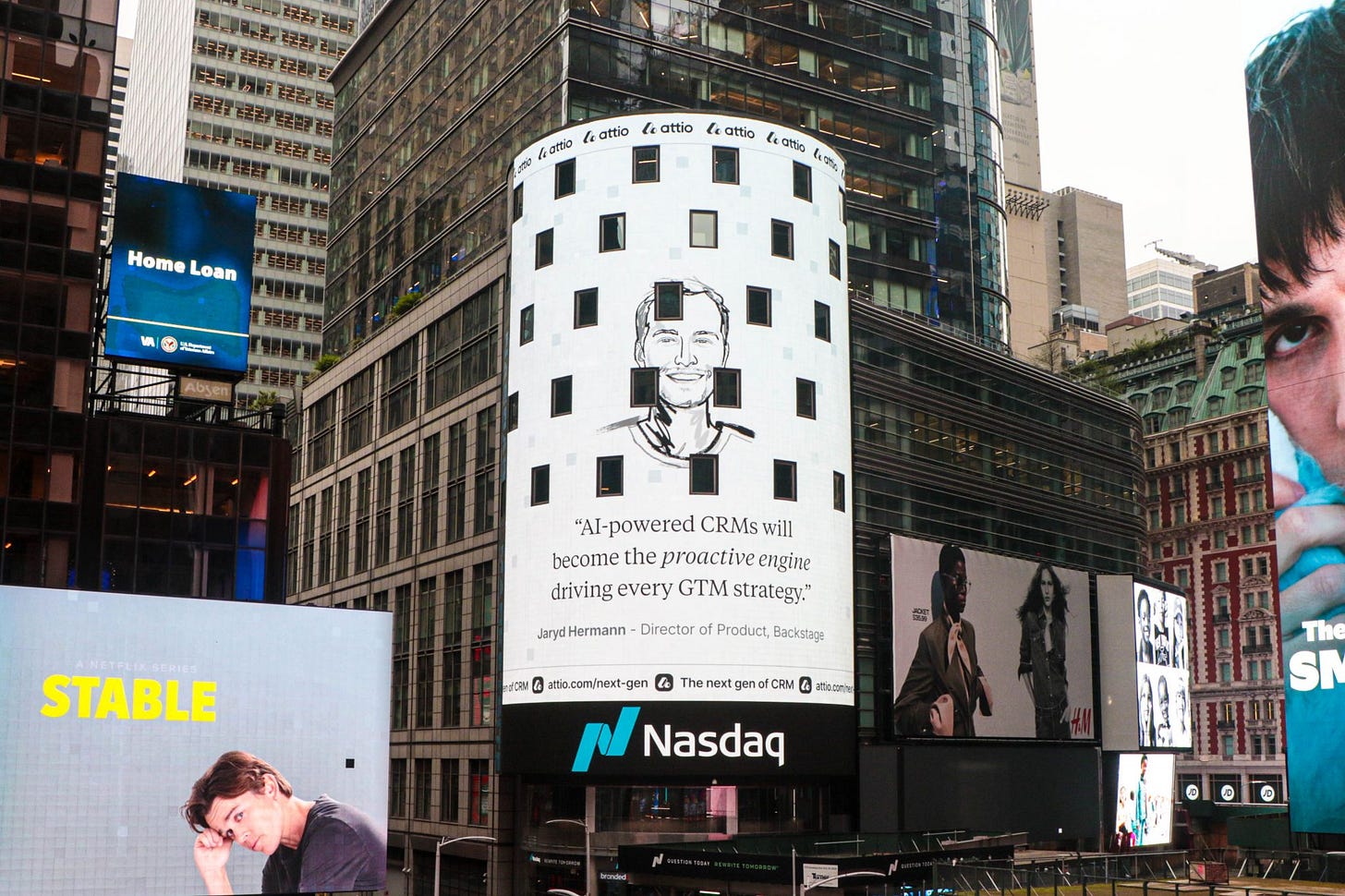
Fun update…I was on a billboard in Times Square this week. 🙃 More on that below! Also, I got a PlayStation this week. I’ve been playing Last Of Us, but if any of you have an account and play Call of Duty, let me know and we can jam. 🫡
Otherwise, let’s just get to it.

5 actionable insights from this week
(1) Is the classic homepage out, and is immediate, ungated, and interactive value in?
As Leah Tharin says in this essay
Users are searching less and less for specific solutions for their problems but get introduced to them through word of mouth, content pieces that link back to them, or channels. If this is true for your product as well, in that users are coming with a specific Idea, then you can just slap them in the face with your ungated experience, treating the Website as an optional support tool rather than an introduction.
Leah argues that for PLG companies, ungated tools or interactive demos can be a more valuable first experience in getting people to try your product and share their email.
Why? Because homepages are often just business cards telling people what you do, but as Leah noted, people are often landing on a page with more intent after learning about a product elsewhere.
The best example of giving users the value they want over telling them what you do is Google. Imagine Google told you about itself first, and then you had to click a button to go search for something. That would be an awful experience. Here are another two examples of leading with interactive value:
Perplexity and Rows
(2) Attio pulled off an incredible influencer campaign by tapping their power users and putting their faces (including mine) on a Times Square billboard
This is an example of some brilliant marketing.
Attio reached out to 50 influential users of their product, including creators and GTM leaders, and asked us for our opinions on how we thought AI would change the CRM landscape.
They then slapped these insights along with our faces on a billboard.
What’s genius, is that this campaign’s ROI had very little (perhaps nothing) to do with the actual billboard itself. Notice how their branding is limited and there’s no CTA? It was all about getting us to engage on social media and share our feature everywhere (because why wouldn’t we, our face was put in one of the most iconic places!). This brought them probably tens of millions of impressions.
(3) Use boring sign-up screens—the data tells us they generally win.
Ali Abouelatta said this in his latest experiment analysis:
Even adding an illustration to an otherwise plain and functional sign-up screen is enough to hurt logins and registrations.
When it comes to sign-up screens, there is often a tradeoff between functionality and delight.
Fortunately, these are the easiest parts of a flow to test and get confident data on given the volume of traffic they get. And, the data shows that basic and boring screens outperform the pretty and playful ones.
This is mostly likely because delight (think images/video/animations) is just distracting to users. Leave that for later in the flow.
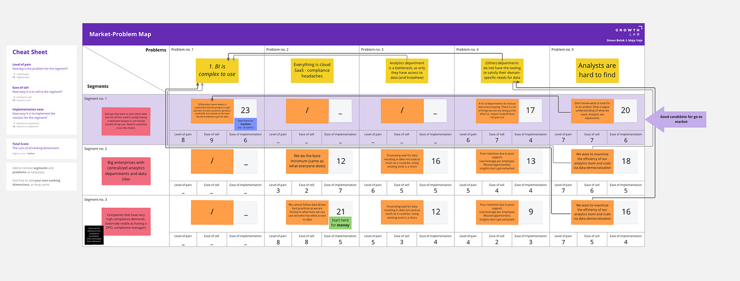
(4) How to use the Market Problem Map Framework
This is the Market Problem Map, and it can be used to help you make sense of the market, its participants and their needs, as well as help you landscape all the potential segments of the market you could play in.
In short, it works like this:
Vertically, fill out specific and actionable segments/personas in the market
Horizontally, list all the problems in the market
At each Segment <> Problem intersection, write down a concrete example of how that problem manifests for that persona.
Then, define the Level of Pain, Ease of Selling, Ease of Implementing
p.s Don’t get bogged down by the scores – most of the value is in relative comparisons and ranking.
You can watch a tutorial of how it works here, or grab this free Miro template to get started.
(5) Are you being too detailed in the wrong ways, and not detailed enough in the right ways?
Wes Kao said the following in this letter:
Too detailed in the wrong way, not detailed enough in the right way is highly situational. A detail in a certain context might be too much. But change the setting, and that same detail could become appropriate.
Why does being detailed in the right way matter? Because every detail adds cognitive load. Cognitive load means friction. And friction prevents people from doing what you want them to do.
The wrong details slow you down and create confusion. The right details advance the conversation, create a deeper understanding, and lead to more productive discussions.
However, sharing the right amount of detail takes an enormous amount of real-time judgment.
Pro tip from Wes: If you think your audience might think you’re being too detailed, mention why those details are important to include.
One lesson from the HTG archives
🧩 When demand is up for your product, build your position in the arena from a different point of view.
Study the market to spot emerging opportunities, don’t rest on your laurels, and study your competitors to understand their most important strategic decisions.
Then build a coherent strategy based on the following:
An understanding of where you are
A different point of view about what the big opportunity ahead is
An honest analysis of the challenges/problems that stand in your way
A fair assessment of your internal capabilities, and your advantages
Ask yourself, which industry rule can we challenge to generate a valuable, different position?
An excerpt from the Nvidia deep dive…👇
Before we say goodbye…
Here’s what I use to grow 🛠️
I use Attio as my go-to CRM to manage all my newsletter sponsorships deal flow and learn more about my email network. (Learn more)
I use Sidebar as a leadership program to accelerate my growth as a product leader. An excellent community for founders and senior leaders. (Learn more)
I use Dovetail as our team’s customer insight hub, helping us spot patterns in feedback across channels. (Learn more)
How I can help you 🤝
Are you a founder looking to grow your business without breaking the bank? If so, I’ve invested in a company (Athyna) that can help you find incredible talent and build out your global team in less than 5 days. Their product, service, and worldwide talent pool are just amazing (and so affordable). Learn more here ↗
And that’s everything for this week’s edition.
If you enjoyed reading today’s email, feel free to forward it to someone! Or you can always hit the like button on this post so more people can discover it on Substack.
Have a fantastic weekend. I’ll see you next time. ✌️
—Jaryd


Excellent issue. Many useful topics. Very practical
Consistency, differientation and famous are three ideals.
So are you famous now? You can frame the shot, frame it, and hang it. Ha.